Select
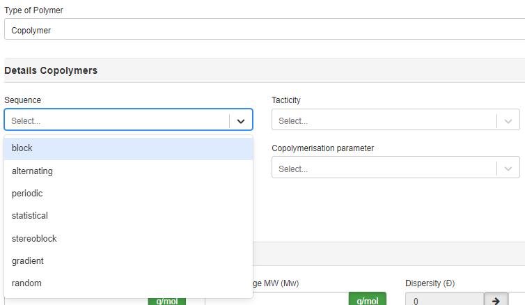
A Select type field offers users a dropdown menu with a curated list of predefined options. End-users can conveniently choose from this list, which consists of custom-defined values.

Select field type
The Select field can be used as a restrictive field. Therefore, the values for the restriction need to be entered as the names of the corresponding option(s).
To set up a Select field, follow these steps:
-
(optional) Create a
Select Listyou need.Click on
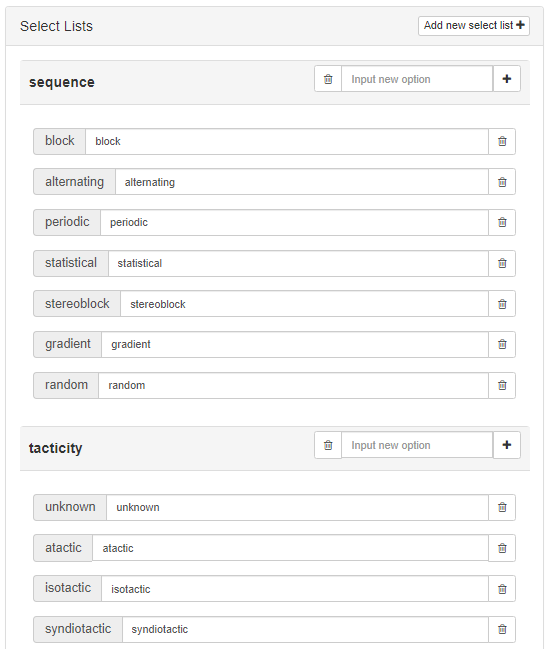
Add new select list➕ button located on the right side of the Work Area to create a new option list you need. Then, enter the desired options into theInput new optionfield and click the ➕ button to add them to the list. You can change the display text to better suit end users. To remove the option, simply click the button next to it.You can create multiple Select Lists and use them in all layers of the element.

-
Choose the
Select Liststhat you want this Select field represent.In the
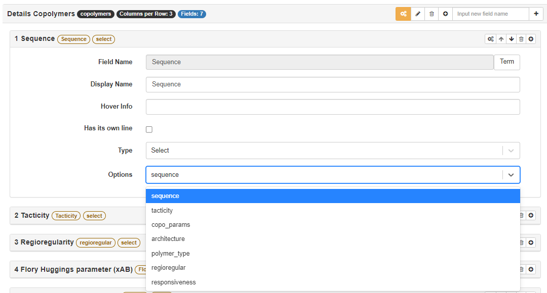
Optionsfield, select theSelect Listyou created in the previous step.

- Done!
See the video below for a demonstration of how to set up a Select field.
YouTube will track your interaction with them.
Example: Designer - Add the Text field and Select field
Extra Field Attributes
Options
This field is used to define the list of predefined options that the user can choose from. The source of the options is the Select List you created.