Visualization
The Visualization Tab in OpenStats allows users to explore and visualize data
through several plot types, including Boxplots, Scatterplots, and Lineplots.
The most important features are described in detail below.
Basic Plot
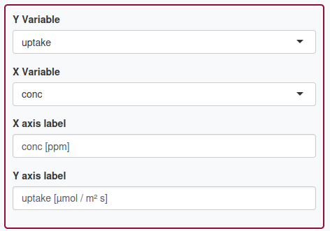
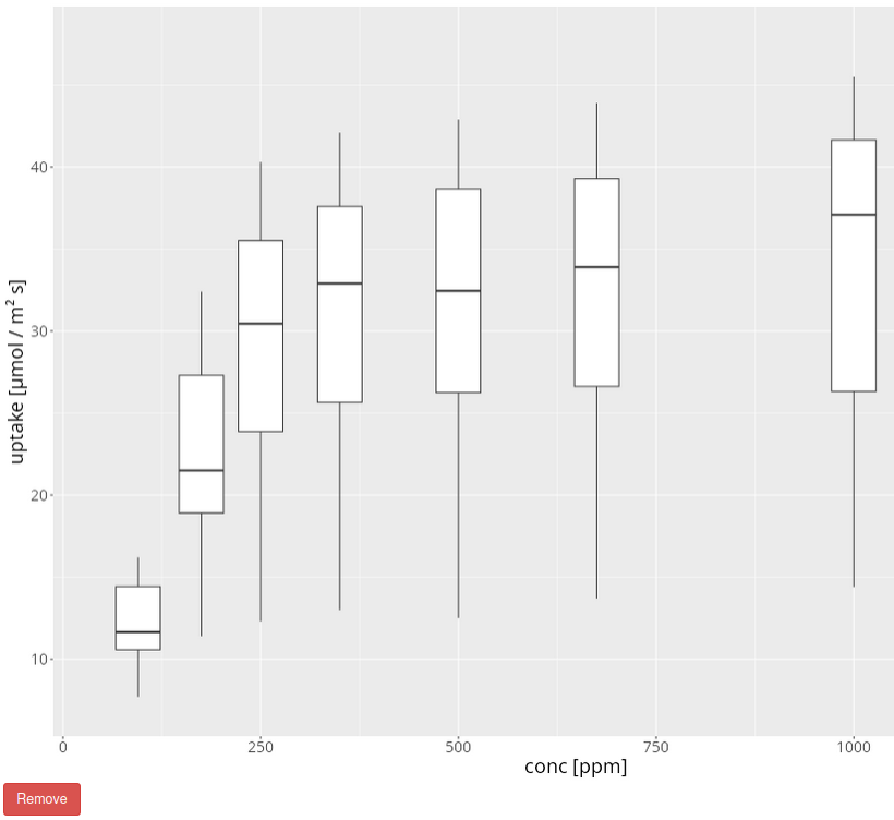
The example below shows how to plot the CO2 uptake of plants against the CO2 concentration.
Investigate the treatment effect
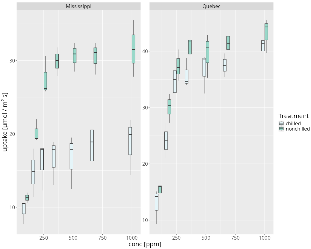
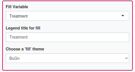
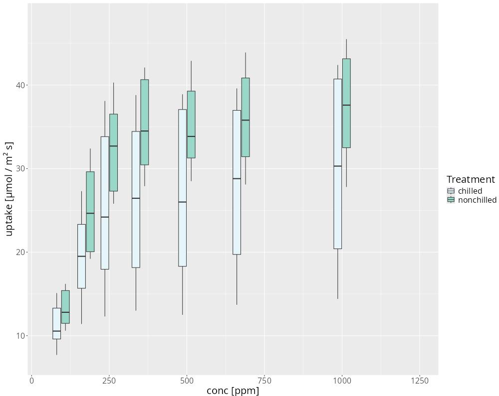
Plants are measured at different CO2 concentrations and at two treatments called chilled and non-chilled. To visualize the effect of the treatments, the fill color of the Boxplots can be set based on the treatment group. As shown below, for each concentration one boxplot for chilled plants (light blue) and one for non-chilled plants (green) are shown.
Investigate the location effect
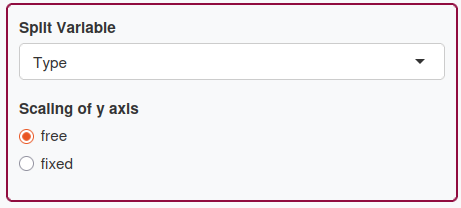
Moreover, plants are measured at two different locations, Mississippi and Quebec. To check whether the location has an effect on the CO2 uptake, the original plot can be split into sub-plots. To do this, the column containing the location information (called Type) has to be chosen in a drop-down menu.